Measuring What Your Processes Leak
Every process has an information budget. When reality deviates from the budget, something is failing , and the deviation is measurable in bits.


When an auditor says “we found a data integrity issue,” everyone in the room nods. When they say “the adverse event coding process is losing 0.45 bits of Shannon entropy per day at the data entry stage, consistent with a suppression pattern,” the room goes quiet. Not because the second sentence is more alarming , but as it describes the same problem. But the first is a label. The second is a measurement. And measurements are what you build systems around.
This post is about postulating a unit of measurement for what goes wrong inside a process. The previous three posts built the architecture we need.
🛡️ Post 1: Audit as Error Correction Code reframed Audit as the enterprise’s sensory apparatus: the counter-entropic force that ensures Strategic Intent survives the noise of execution. Introduced the shift from periodic sampling to continuous signal processing.
📐 Post 2: The Geometry of Risk gave risk a shape. Organizational health lives on a manifold in high-dimensional space; topological features (connected components, loops, voids) act as structural early-warning signals. The Topological Stability Index (TSI) provides 30–40 days of advance warning before crises manifest.
🎲 Post 3: Stochastic Governance Replaced static Red/Amber/Green dashboards with Bayesian Probability of Failure (PoF): a continuously updating belief about process health using Beta-Binomial conjugacy. Every new piece of evidence (operational telemetry, audit findings, system logs) shifts the posterior. Governance becomes a living calculation, not a quarterly ritual.
What was missing: a way to quantify the amount of information a process destroys, injects, or distorts as data flows through it.
The Analogy and Its Limits
Let me be upfront: the metaphor of “corporate entropy” is one of the most abused in management literature. Organizations are not closed thermodynamic systems. There is no conservation of energy in a corporate structure. The Second Law, in its strict physical sense, does not apply.
What I am claiming is narrower and more useful. Shannon entropy, the information-theoretic measure of uncertainty in a data distribution, is a rigorously defined, computable quantity that can be applied directly to organizational data flows.¹
Every business process is an information channel. Data enters (patient records, batch parameters, invoice details). The process transforms it (validation, aggregation, reporting). Data exits. When the process works, transformations are intentional: you aggregate because you want summaries, you validate because you want to filter noise, you report because you want decisions. When it fails, transformations become unintentional: information is lost that shouldn’t be, noise is injected that wasn’t there, distributions shift in ways no one designed. Shannon entropy gives us a way to measure this: precisely, cheaply, and continuously.
A caveat I want to embed early: entropy does not replace the auditor’s qualitative work. It’s a thermometer. A doctor doesn’t diagnose using only temperature, but 39°C tells them where to focus. Entropy directs attention, while people deliver understanding.
There is, however, one place the thermodynamic analogy does help: directionality. In physics, entropy increases in isolated systems because there are vastly more disordered states than ordered ones. Corporate processes exhibit the same asymmetry, as there are a handful of ways a clinical trial can maintain data integrity and thousands of ways it can lose it. This is why investigation is necessary as a continuous energy input, not a periodic check. And that “energy” includes qualitative interventions: training, SOPs, walkthroughs. Mathematics measures how well these interventions work, while it doesn’t pretend they aren’t needed.
¹ For readers unfamiliar with the formalism: Shannon entropy
measures the average “surprise” in a distribution — how unpredictable the next observation is. Each term pᵢ log₂(pᵢ) captures one category’s contribution: rare events (small pᵢ) contribute more surprise per occurrence, while common events (large pᵢ) contribute less. The summation aggregates across all categories, and the negative sign makes the result positive (since log of a fraction is negative).
A few anchoring examples. A fair coin: two equally likely outcomes, H = 1 bit, you need exactly one yes/no question to determine the result. A fair six-sided die: H ≈ 2.58 bits, you need between two and three binary questions. A loaded die that always lands on 6: H = 0 bits ,no uncertainty, no information. The unit “bit” is literal: it’s the number of binary digits needed to encode the outcome.
When all n outcomes are equally likely, entropy reaches its maximum: H = log₂(n). When one outcome dominates, entropy drops toward zero. This makes it a natural “diversity index” for categorical data, and that’s exactly why it works for audit. A healthy adverse event distribution has high entropy (many AE types, none dominating). A suppressed one has lower entropy (some types have disappeared, concentrating mass on fewer categories). The difference between the two is measurable, in bits, and that difference is the signal.
The Entropy Budget of a Process
Every business process has an entropy budget, a predictable relationship between input and output information content.
Consider a clinical trial data pipeline: Collection → Entry & Validation → Aggregation → Reporting. At Collection, entropy is high: many patients, many AE types, many data points. Validation reduces it slightly: noise removal, coding standardization. Aggregation reduces it substantially, collapsing individual records into summary statistics discards individual-level variation, by design. Reporting should preserve what aggregation produced.
At each stage, entropy should change in predictable ways:
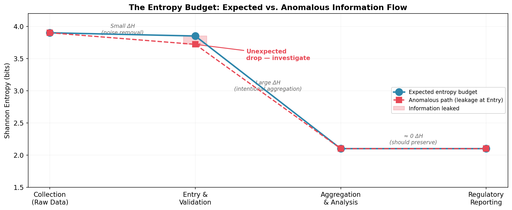
The blue line shows the expected budget: a small reduction at validation (noise removal), a large reduction at aggregation (summarization by design), and preservation through reporting. The dashed red line shows what happens when something goes wrong at Entry, an unexpected drop. The pink gap is information that leaked without authorization. That gap is measurable in bits. And it’s a signal worth investigating.
“Investigate” is the key word. Entropy tells you that something changed and where in the pipeline. The why still requires human expertise: audit trails, interviews, operational context.
Three Failure Modes, Three Entropy Signatures
Different process failures leave different entropy fingerprints:
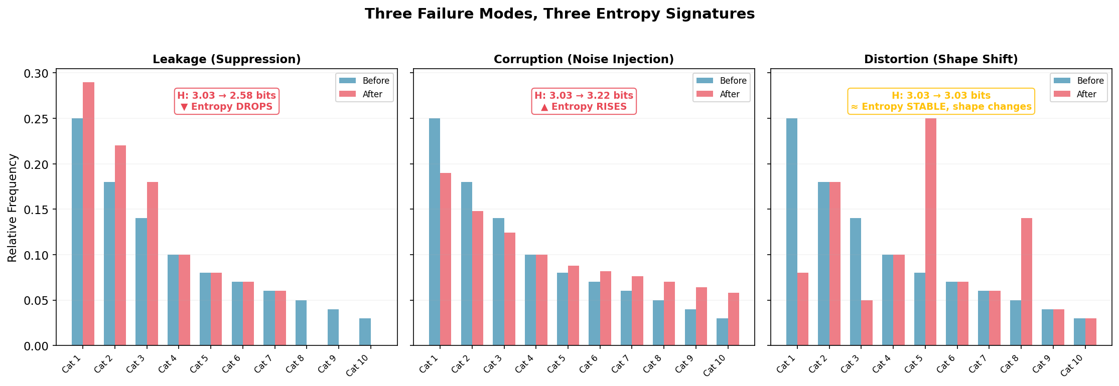
Leakage (left): Rare categories disappear; their mass migrates to common ones. Entropy drops from 3.03 to 2.58 bits, a loss of 0.45 bits of information content. The signature of suppression: legitimate variation silently removed. A clinical site stops reporting rare adverse events because they’re hard to code. A supply chain routes all orders to preferred vendors, collapsing supplier diversity.
Corruption (center): The distribution flattens toward uniform. Entropy rises from 3.03 to 3.22 bits. The signature of noise injection: the process adding randomness not present in the source. Transcription errors that scramble structured data. Fabricated journal entries that lack the natural correlations of authentic transactions, real transactions have structure; fake ones often don’t.
Distortion (right): Entropy stays at 3.03 bits but the shape changes, categories swap importance. The subtlest and most dangerous mode, because aggregate entropy won’t catch it. You need per-category decomposition to see it. This might be systematic recoding: one category recorded as another, preserving total diversity but corrupting the underlying pattern. Notice: if you rely on aggregate entropy alone, you miss this entirely.
The three signatures together form a diagnostic taxonomy. But notice: no single metric covers all three. Aggregate entropy catches leakage and corruption; only per-category decomposition catches distortion. This is one more reason why entropy monitoring supplements rather than replaces investigation, and why the auditor’s judgment about which tool to deploy, and when, remains the irreducible core of the work.
A Simulation: Entropy Monitoring in a Clinical Data Pipeline
Fifty clinical sites, 20 AE categories, 300 days. On Day 150, one site begins miscoding serious adverse events (ALT increased, Cardiac event, Hepatotoxicity) as benign categories (Headache, Fatigue) realistic for a site under resource pressure. The failure affects ~2% of daily records. A needle in a haystack.
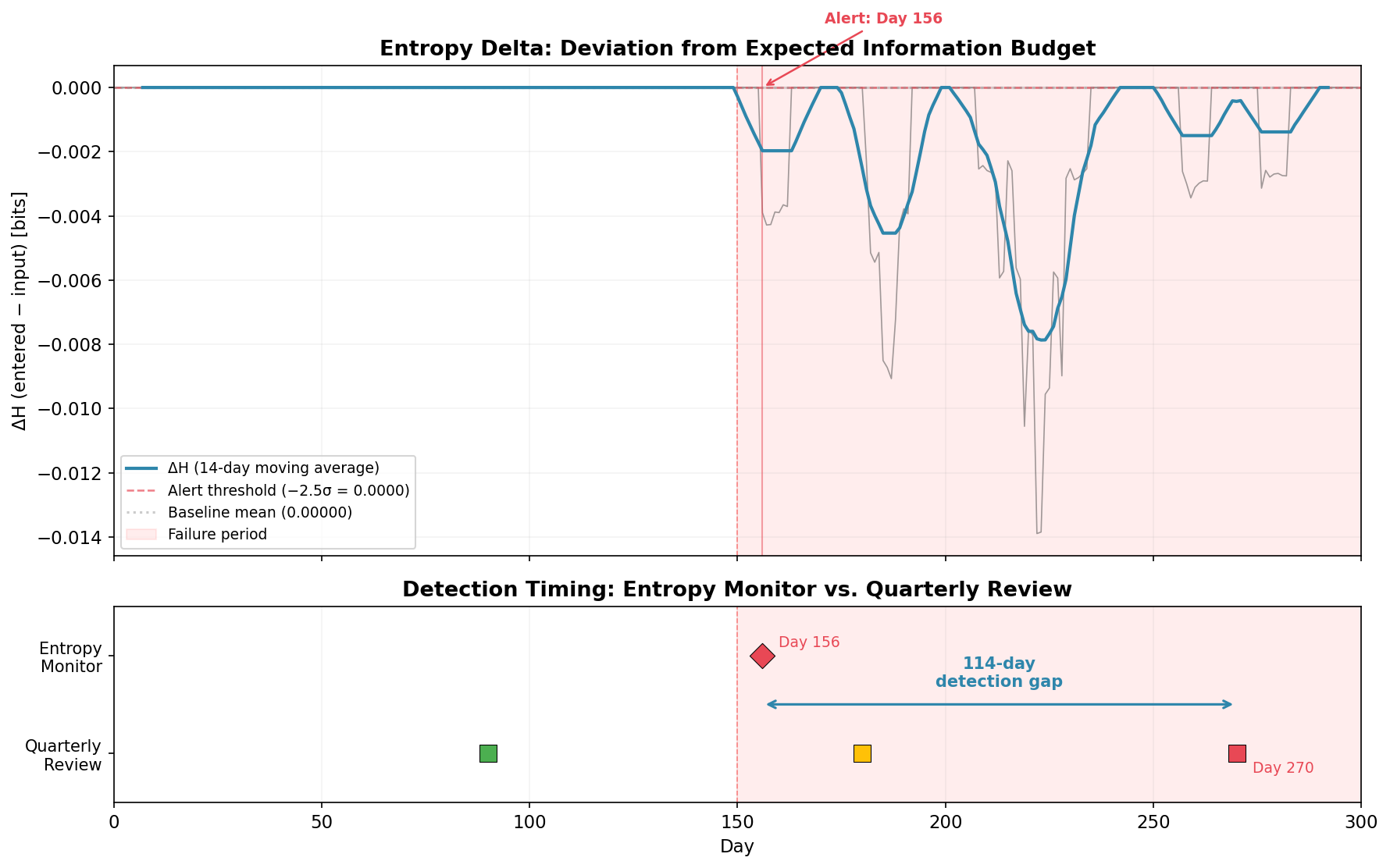
The top panel shows the entropy delta (ΔH = entered − input) over time. The 14-day moving average makes the signal readable. Before Day 150: flat at zero. After: an immediate, sustained drop to −0.002 to −0.014 bits. The entropy budget is being violated.
The monitor triggers an alert on Day 156: six days after onset.
The bottom panel makes the comparison concrete. The quarterly review cycle (colored squares) can’t catch the problem until Day 270, when 120 days of failure data finally dominate the quarterly sample. The Day 180 review (amber square) saw only 30 affected days out of 90, not enough to trigger concern in a traditional sampling framework.
Detection gap: 114 days. In a clinical trial, that’s four months where serious adverse events are being silently reclassified as benign, four months where the safety profile presented to the Data Monitoring Committee doesn’t match reality. Four months of early intervention, or four months of degradation. Depends on whether you had the thermometer running.
From Detection to Investigation: The Decomposition
Once entropy flags an anomaly: which categories are driving the shift?
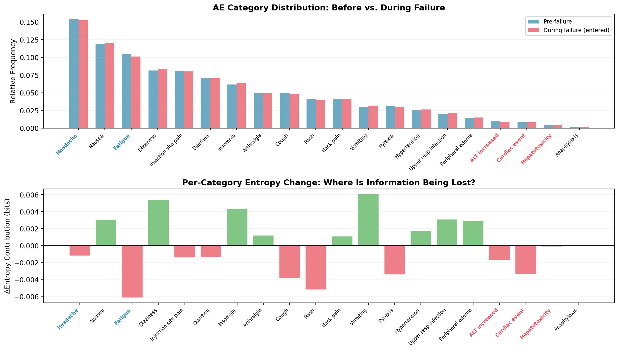
The top panel compares category frequencies before and during the failure. The changes are subtle (one site out of fifty) but visible: the red-labeled categories (ALT increased, Cardiac event, Hepatotoxicity) show frequency reductions; the blue-labeled redirect targets (Headache, Fatigue) show increases.
The bottom panel decomposes the entropy change per category. It’s noisy - and I want to be honest about that. Rash, Cough, and Diarrhea show non-trivial shifts from pure sampling variation, not from the actual failure. The decomposition narrows the search space but doesn’t eliminate false leads. You’d cross-reference against coding logs, interview the site monitor, check for staffing changes. The chart generates hypotheses; the auditor tests them.
The Payoff: Entropy Feeds the Bayesian Framework
Recall the Bayesian Probability of Failure (PoF) from Post 3: a continuously updating belief about process health, using Beta-Binomial conjugacy. Evidence streams update your prior, each observed failure or success shifts the PoF.
But what if the failure is too subtle for traditional telemetry to detect? Our simulation models exactly this: one site miscoding 2% of records. A per-record error-rate check sees ~2% errors before and ~2.1% after. The signal drowns in noise.
Entropy sees what error rates can’t. When ΔH drops below the noise floor and stays there, that’s not a single anomalous record , rather it’s a sustained distributional shift across hundreds of data points. Convert the entropy signal to pseudo-observations in the Bayesian update: a persistent negative ΔH is evidence that the process is failing, even though individual records look clean.
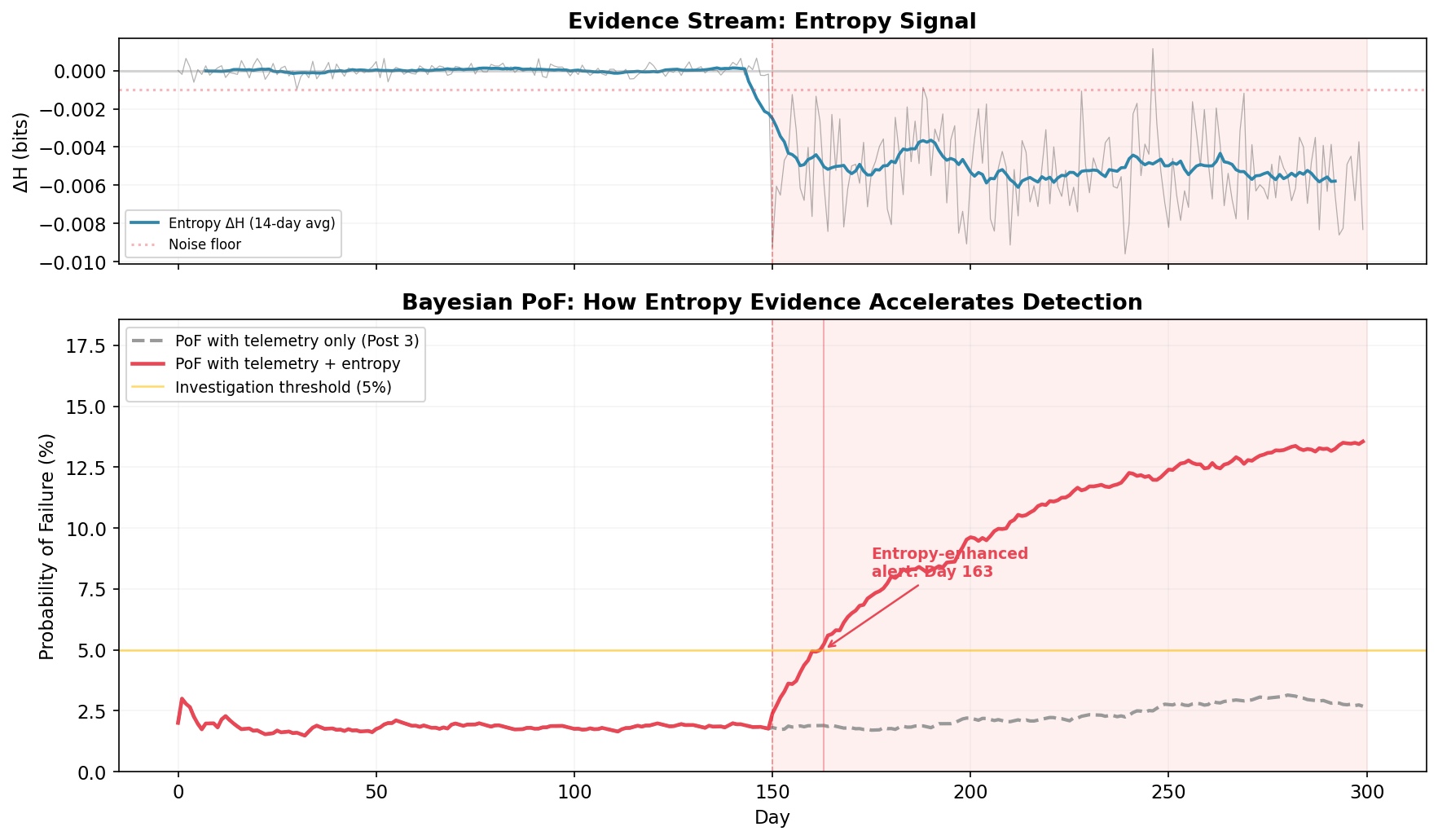
The gray dashed line is the PoF using telemetry alone( the Post 3 approach). It drifts upward slightly during the failure period, but never crosses the 5% investigation threshold in 300 days. The failure is invisible to traditional metrics. You could run the Post 3 framework for a full year and never trigger an investigation.
The red line adds entropy evidence. The moment ΔH drops below the noise floor and stays there, the Bayesian posterior shifts. The combined PoF crosses the investigation threshold on Day 163, thirteen days after onset. By Day 200, it’s above 8% and climbing. The framework isn’t just detecting the problem earlier, it’s expressing growing confidence that something is wrong, exactly as it should.
This is the point of the whole series: Geometry tells you where risk concentrates; topology tells you what kind of structural change is occurring; Bayesian updating tells you how confident to be; entropy tells you how much information your processes are losing. No single instrument catches everything, but when entropy feeds distributional evidence into the Bayesian framework, the system reaches decision-grade confidence about failures that no individual metric would escalate.
The Q1 Focus
This post is part of the quarterly serie on Audit 2.0 in the Age of Non-Deterministic Systems.
Please refer to previous posts if needed
The simulation, notebook, and all figures from this post are available on GitHub.
Stay With Me
So far we’ve built instruments that observe: they detect, measure, and calibrate. But diagnosis is passive. It waits for the manifold to warp, for entropy to drift, for PoF to rise.
Next time, I want to flip the question entirely. Instead of “is something going wrong?” we’ll ask “how could this organization fail?” and then simulate it, thousands of times, before it happens.
That’s where the framework stops observing the organism and starts stress-testing it.