Guessing Where Your Organization Breaks - Before It Does
One plant. 50% of supply. 100,000 patients. Yet, the risk register said "Medium.


In November 2022, FDA inspectors walked into an Intas Pharmaceuticals plant in Gujarat, India. They found piles of shredded documents. A truck loaded with bags of torn papers. A black plastic bag hidden under a staircase, reeking of chemicals. The inspectors wrote what may be the most telling phrase in the history of pharmaceutical compliance, Cascade of Failure.
What happened next is the case study this entire post exists to formalize.
Intas supplied roughly 50% of America’s cisplatin, a frontline chemotherapy drug used against testicular, ovarian, bladder, lung, and cervical cancers. When the plant shut down, there was no surge capacity. Other manufacturers couldn’t ramp up. Hospitals began rationing. By May 2023, 93% of U.S. academic cancer centers reported a carboplatin shortage; 70% couldn’t get cisplatin. Oncologists who had trained for years to fight cancer found themselves deciding which patients would get treatment and which would not. The FDA resorted to emergency imports from an unapproved Chinese manufacturer.
The supply chain had plenty of risk registers. None of them predicted this. Not because the people writing them were incompetent, but because the tool, a list of independent risks, each scored in isolation, is structurally incapable of capturing what happened. What happened was a cascade: a failure that propagated through a dependency graph, amplified at each hop, until it reached the terminal node. The patient.
This post builds the tool that could have seen it coming. The previous four posts built instruments that observe: they detect, measure, and calibrate. This post flips the question entirely. Instead of “is something going wrong?” we ask “how could this organization fail?” and then simulate it, thousands of times, before it happens.
🛡️ Post 1: Audit as Error Correction Code reframed audit as the enterprise’s counter-entropic force: the sensory apparatus that ensures Strategic Intent survives the noise of execution.
📐 Post 2: The Geometry of Risk gave risk a shape. Organizational health lives on a manifold; topological features act as structural early-warning signals. The Topological Stability Index provides 30–40 days of advance warning.
🎲 Post 3: Stochastic Governance replaced static Red/Amber/Green dashboards with Bayesian Probability of Failure (PoF): a continuously updating belief about process health using Beta-Binomial conjugacy.
📡 Post 4: Measuring What Your Processes Leak introduced Shannon entropy as the unit of process degradation, measuring, in bits, how much information a process destroys, injects, or distorts. When ΔH drops below the noise floor, the PoF crosses investigation threshold 114 days before a quarterly review would catch it.
What was missing: a way to move from diagnosis to prognosis. Not “is the process drifting?” but “which structural dependencies would cause the system to cascade-fail if stressed?”
From Risk Registers to Dependency Graphs
A traditional risk register lists risks as independent items:
“Supplier concentration risk. Medium.” “Key person dependency. High.” “Regulatory change. Low.” Each risk lives in its own row, assessed in isolation, scored on a matrix.
Intas was in someone’s risk register. Probably scored “Medium” or “High” under supplier dependency. And that score sat there, inert, until 100,000 cancer patients couldn’t get treatment.
The problem is not that the risk was unidentified. The problem is that risk registers are lists, and organizations are graphs.
A pharmaceutical supply chain is a directed network. The API supplier feeds the formulation plant. The formulation plant depends on a validated QC laboratory. The QC lab depends on a single LIMS system maintained by one IT contractor. The contractor’s knowledge is undocumented. Each node looks individually manageable. But the graph structure creates hidden correlations: a single vendor’s failure cascades through three tiers, and the cascade path is invisible to anyone reading the register row by row.
Formally: we model the organization as a directed graph G = (V, E) where V is the set of organizational nodes (people, systems, vendors, processes, regulatory approvals) and E represents dependency edges. Each node has a base failure probability drawn from its operational history, and each edge carries a contagion weight: how strongly a failure upstream propagates downstream.¹
This is the same modeling paradigm used in epidemiology (disease propagation), network security (attack graphs), and financial systemic risk (counterparty contagion). What is new here is applying it to audit and organizational resilience and making it practical enough for an audit team to implement in weeks, not years.
The simulation, notebook, and all figures from this post are available on GitHub.
¹ For readers unfamiliar with graph theory: think of it as a map of “who depends on whom.” Each circle (node) is a person, system, or vendor. Each arrow (edge) means “if this node fails, that node is in trouble.” The number on the arrow,the contagion weight, is how much trouble: 0.95 means near-total dependency, 0.30 means there’s a decent backup. The simulation then asks: “If we randomly break things according to their historical failure rates, what actually happens?” That question, asked 10,000 times, gives us a distribution of outcomes rather than a single guess.
The Simulation: A Pharma Supply Chain Under Stress
To make this concrete, we model a simplified but realistic pharmaceutical supply chain, the kind you might find in a mid-size European biotech producing a specialty injectable. Twelve nodes, from the single-source API vendor through to the terminal node: the drug reaching the patient.
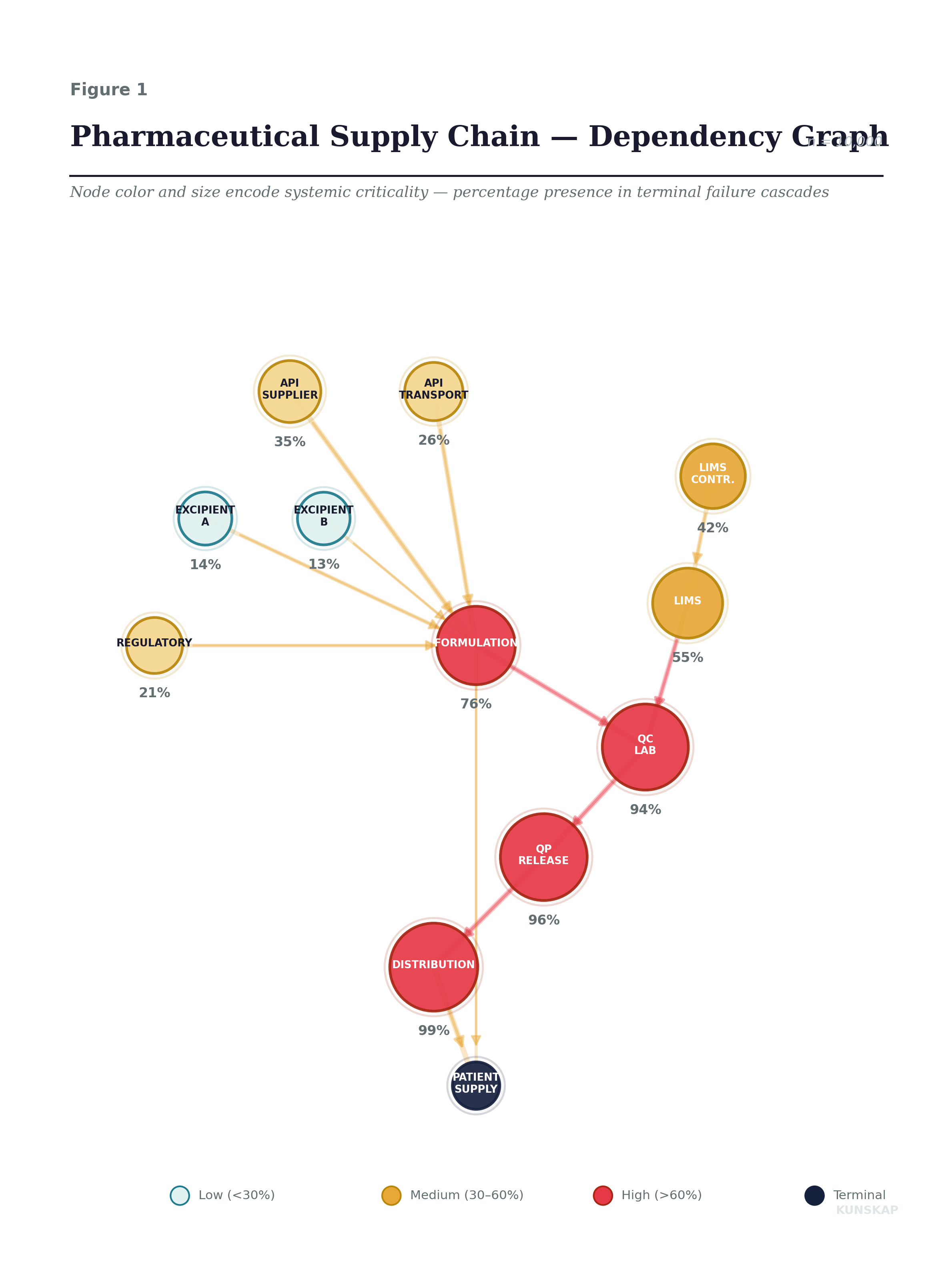
The percentages on each node are what the simulation reveals, but the point of the graph is the structure. Notice how the LIMS Contractor (upper right, 42%) sits far from the patient, two hops upstream of the QC Lab, three from Distribution and yet its failure cascades forward with surprising force. That gap between “distance from the terminal node” and “systemic impact” is the central discovery of this post. It is what risk registers cannot see and what Monte Carlo simulation exposes.
The setup: each node has a base failure probability calibrated to realistic operational data. The API Supplier fails 8% of the time. The LIMS Contractor, being a single undocumented resource, fails 12%, the highest individual probability in the graph. The Qualified Person Release has only a 3% base failure rate. Each dependency edge carries a contagion weight: the API Supplier → Formulation link is 0.95 (near-total dependency: no API, no product, think Intas and cisplatin), while the backup Excipient B → Formulation is only 0.30 (it matters only when the primary fails too).
The Cascade Mechanism
When a node fails, it shocks its dependents. A node depending on a single failed predecessor with contagion weight w sees its effective failure probability jump to:
\(p_{shocked} = 1 − (1 − p_{base}) × (1 − w)\)
For multiple simultaneous upstream failures, the shocks compound multiplicatively, each additional failed predecessor tightens the vice. This is a contagion model: similar in structure to epidemiological SIR models, but applied to operational failure. The key insight is that even when individual failure probabilities are low, graph topology can create emergent fragility that no single-node assessment would reveal.²
² The cascade mechanism has an important property: it is non-linear. Two upstream failures don’t produce twice the shock of one, they compound. If node A depends on two failed predecessors with contagion weights 0.70 and 0.85, the effective shock is not 0.70 + 0.85 = 1.55 (nonsensical) but 1 − (1 − 0.70)(1 − 0.85) = 0.955. This multiplicative compounding is why small individual probabilities can produce large systemic risk and why additive risk scoring (the heart of most risk registers) fundamentally underestimates correlated failures.
Monte Carlo, or 10,000 Possible Futures
I ran 10,000 independent simulations. In each one, I sampled initial failures from the base probabilities, propagate the cascade until it stabilizes, and record the outcome: which nodes are down, and critically, did the terminal node, Patient Supply, fail?
The result is not a single number but a distribution of organizational failure states. And distributions, as Post 4 demonstrated, carry far more information than point estimates.
The following one is the most important figure in this post. Look at the shape.
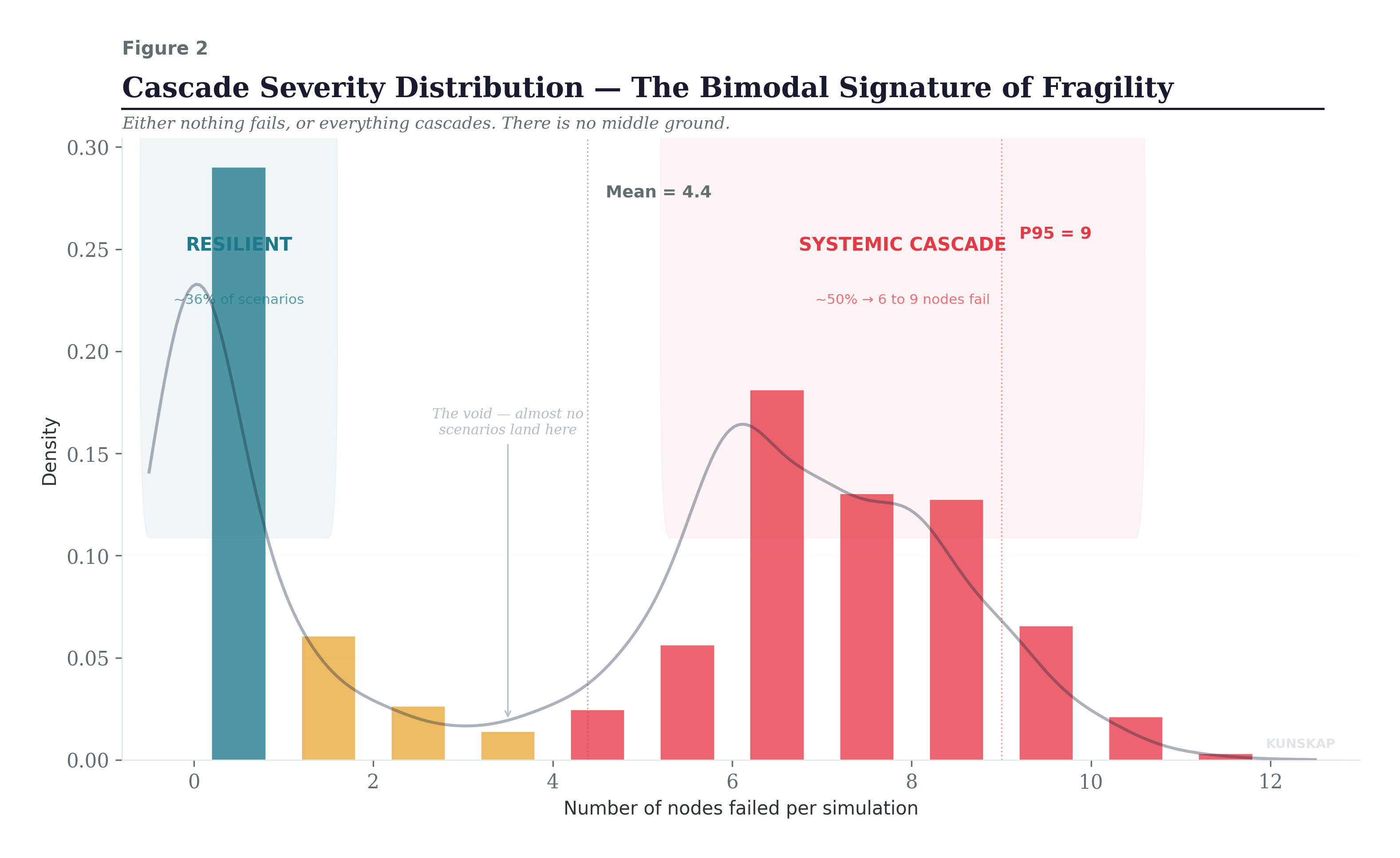
The cascade severity distribution is bimodal: in about 36% of simulations, nothing cascades at all, zero or one node fails. But in the remaining scenarios, the cascade propagates through 6 to 9 nodes, taking down most of the supply chain. There is almost nothing in between.
A risk register cannot produce this insight. It tells you that each node has a “Medium” or “High” probability. It does not tell you that the system has a phase transition, that once a cascade starts, it almost always runs to completion. That is exactly what happened with cisplatin: once Intas went down, the shortage didn’t stabilize at a manageable level. It propagated to carboplatin, then to methotrexate, then to treatment rationing, then to patients not getting treated. Phase transition. No middle ground.
Node Criticality ≠ Node Probability
This figure is the core of the adversarial audit finding. The small navy dots show each node’s base failure probability, the number you would find in a risk register. The larger colored dots show the node’s systemic criticality: how often it appears in simulations where Patient Supply was disrupted.
The gap between the two is what the simulation reveals and what traditional assessment structurally cannot see.
Look at QP Release: 3% base failure probability, the lowest in the chain. But it appears in 96% of all terminal failure scenarios. Its systemic criticality is 32 times its base probability. Why? Because it sits on the only path between QC validation and distribution. It is a structural chokepoint, and the graph makes it lethal regardless of how reliable the individual node is. The Intas parallel: cisplatin was cheap, reliable, well-established, and precisely because of that, the system consolidated around it until one failure point could cripple national supply.
Now look at LIMS Contractor: 12% base failure probability. This isthe highest. A risk register would flag this loudly. And it matters, but for a different reason than the register implies. The contractor appears in 42% of terminal failure scenarios, and conditional on the contractor failing, there is a 90.4% probability of patient supply disruption. The risk register says “High” while he simulation measures “90.4% conditional cascade-to-terminal” And measurements, as I argued in Post 4, are what you build systems around.
Fragility Amplification
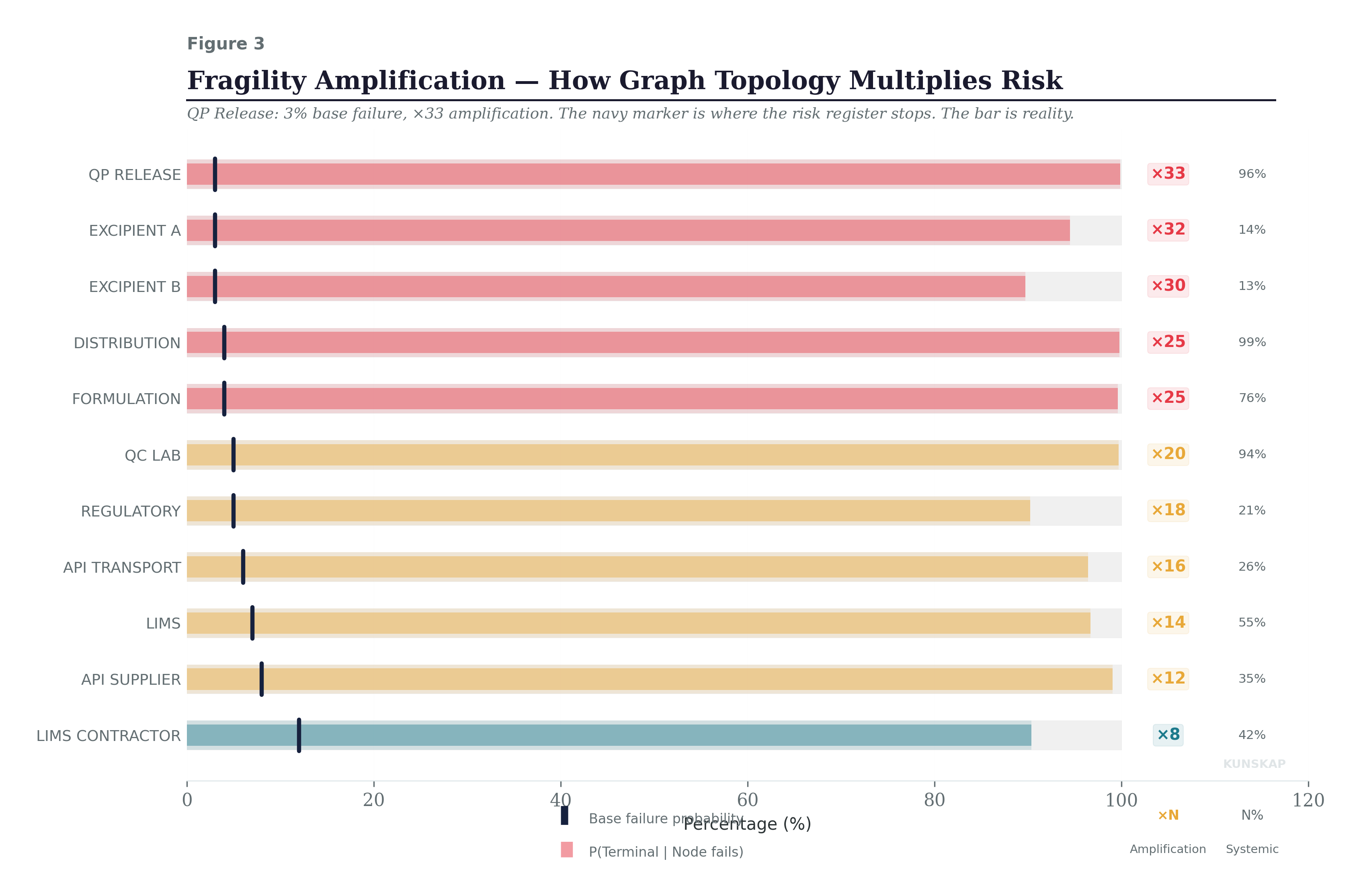
This figure shows the amplification factor for each node: the ratio between its conditional terminal impact and its base failure probability. The ×33 next to QP Release means that graph structure amplifies its risk by a factor of 33. Distribution gets ×25. Even the backup Excipient B, which seems harmless at 3% base probability, carries a ×30 amplification, because when it fails, it typically fails alongside Excipient A (the primary), creating a correlated excipient shortage that propagates through Formulation.
The amplification factor is a board-ready metric. A node with high base probability but low amplification (like LIMS Contractor at ×8) is risky in itself but somewhat structurally contained. A node with low base probability but extreme amplification (like QP Release at ×33) is a structural trap, the system is organized around it, and if it fails, almost nothing prevents the cascade. These are different risks requiring different interventions: the first needs operational improvement; the second needs architectural redundancy.
How Robust Are These Findings?
A legitimate objection to everything above: the contagion weights are estimated, not measured. How much do the findings depend on getting those estimates right?
This matters. If the entire analysis collapses when you change a weight by 10%, it’s a fragile model describing a fragile system, not useful. If the structural findings hold across a range of plausible weights, the model is telling you something real about the topology, not just reflecting your assumptions back at you.
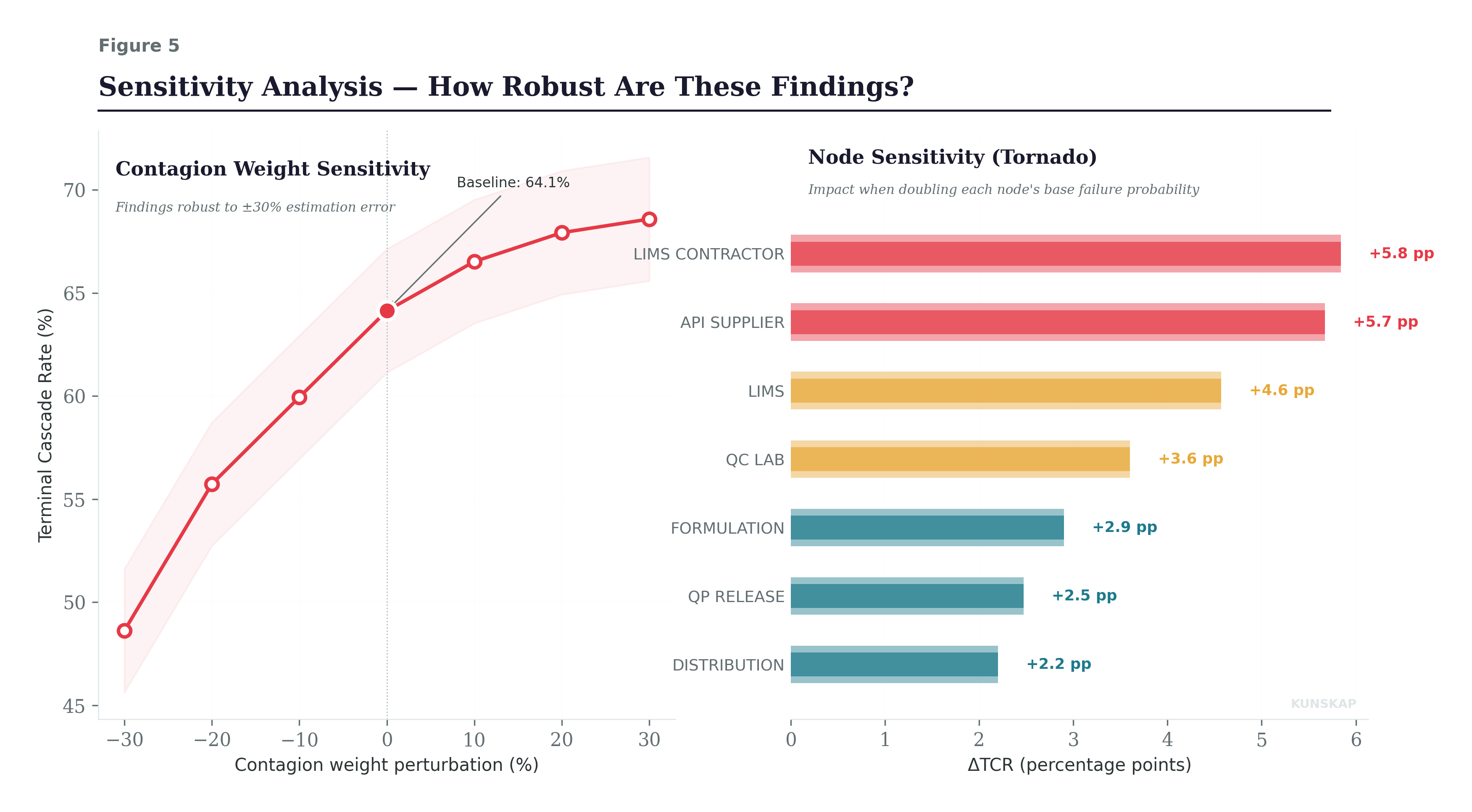
The left panel shows what happens when all contagion weights are perturbed simultaneously by ±30%. The Terminal Cascade Rate ranges from 49% (all weights reduced 30%) to 69% (all weights increased 30%). That’s a meaningful range but the structural findings hold across it. The system remains bimodal at every perturbation level. The same nodes dominate the cascade paths. The minimum cut remains two nodes. The magnitude of the CFI shifts, but the rank ordering of critical nodes and the qualitative shape of the failure distribution are stable. This is the key takeaway: you don’t need perfect weights to identify your structural vulnerabilities. You need approximately right weights to get approximately right priorities.
I want to be honest: the contagion weight estimation is the weakest link in the methodology. In practice, you’d calibrate these from historical incident data, operational dependency assessments, and expert judgment. The estimates will be imperfect. But the sensitivity analysis demonstrates that “imperfect” is not “useless”: the structural insights are robust to substantial estimation error, and that robustness is itself a finding worth reporting to the board.
Audit as Adversarial Intelligence
What this post describes is a philosophical shift in the audit function’s self-conception. The traditional auditor asks: “Did you follow the procedure?” The Bayesian auditor from Post 3 asks: “Is your process drifting?” The entropy auditor from Post 4 asks: “How much information is your process losing?” The adversarial auditor asks:
If I were the universe (indifferent, entropic, and occasionally malicious) which of your dependencies would I exploit first?
And here is where the instruments converge.
Imagine entropy monitoring on the QC Lab node flags a sustained ΔH of −0.3 bits, the entropy budget is being violated, exactly the signature Post 4 trained us to recognize. That signal feeds into the Bayesian PoF for that node, revising its base failure probability upward from 5% to 9%. The cascade model, re-run with the updated probability, shows that terminal disruption risk has jumped from 64% to 78%. The geometry from Post 2 confirms: the risk manifold’s curvature has increased in the QC-LIMS region. Four instruments, one convergent diagnosis and crucially, a quantified one that the board can act on today, not after the quarterly review.
Complex systems do not fail because someone breaks a rule. They fail because correlated stresses interact with structural vulnerabilities in ways that nobody anticipated, because nobody simulated the compound scenarios. Intas didn’t fail because a plant shutdown was unpredictable. It failed because the system had a two-node cut, a bimodal failure distribution, and a 50% supply concentration, and nobody ran the simulation that would have revealed these properties before 100,000 patients were affected.
The audit function, equipped with Monte Carlo and graph theory, becomes the organization’s immune system: not reacting to infection, but constantly scanning for the structural weaknesses that infection exploits. Not asking “are we healthy today?” but “where would we break tomorrow?”
The Final Post for Auditing 2.0
We came to an end of the first quarter, and with it the sequence of topics. We have now built or better outlined five instruments. Detection (Post 1). Geometry (Post 2). Belief calibration (Post 3). Information measurement (Post 4). And with today stress-testing came.
In two weeks I am closing the loop for the topic related to Auditing 2.0, prior to move to another one. The clue points to a single object beneath all of them: drift. Not drift as metaphor, not “the organisation is drifting” in the vague sense that appears in board reports, but drift as a measurable trajectory through the space of probability distributions. The process does not jump from healthy to broken. It travels there, along a path, at a velocity. And that velocity (λ) is what every instrument in this series has been detecting without naming: each one catching a different shadow of the same geometric object as it moves through the statistical manifold.
The final post names it, constructs it, and shows that the audit function, fully realised, is not a collection of methods. It is a single measurement:
How fast is this organisation moving away from where it should be, and in which direction?